QUIVEY'S GROVE RESTAURANT - REDESIGN
I defined the vision for a richer, more accessible site that did the work for the clients. I evangelized this vision and worked closely with the stakeholders and other team members to realize this vision across the site.
CHALLENGE
To update the previous site and bring it into the current design aesthetic, while building trust with the stakeholders to allow such a great move forward. The main focus was to build a site that was inviting to a younger demographic while at the same time making the site easier for an aging clientele to use and not feel alienated by the redesign.
ROLE
Vision and strategy, creative direction, developer, UI/UX and visual design
UX PATTERNS
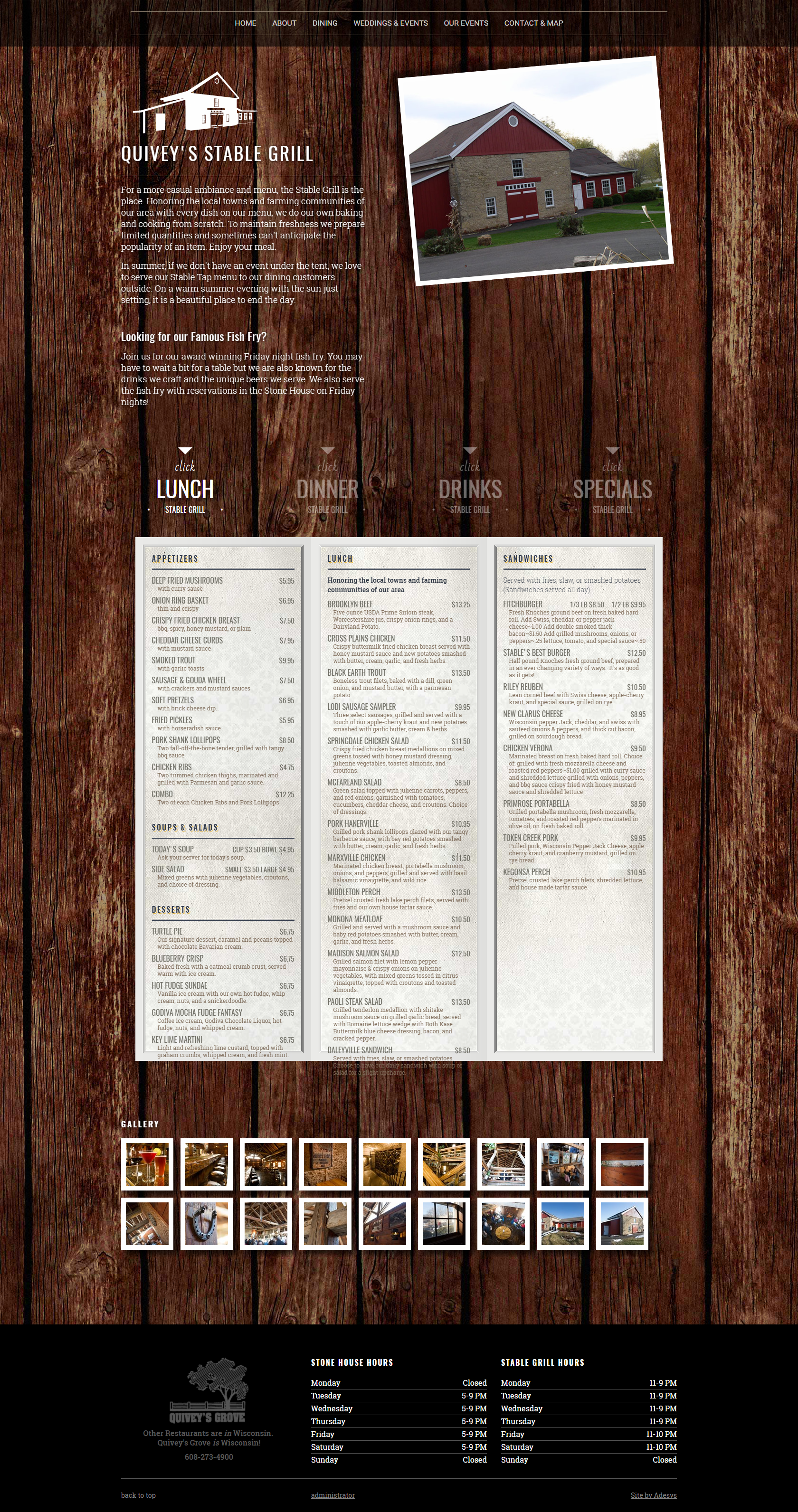
I designed and tested common UX patterns to be used across the site. These patterns had flexibility built in to cover a wide range of customer requirements per task, while creating consistency across the site.
SKILLS USED
Primary Software Used: Photoshop | Invision | Html | Css | Bootstrap | Illustrator | Visual Studio | Lucid Charts | Balsamiq
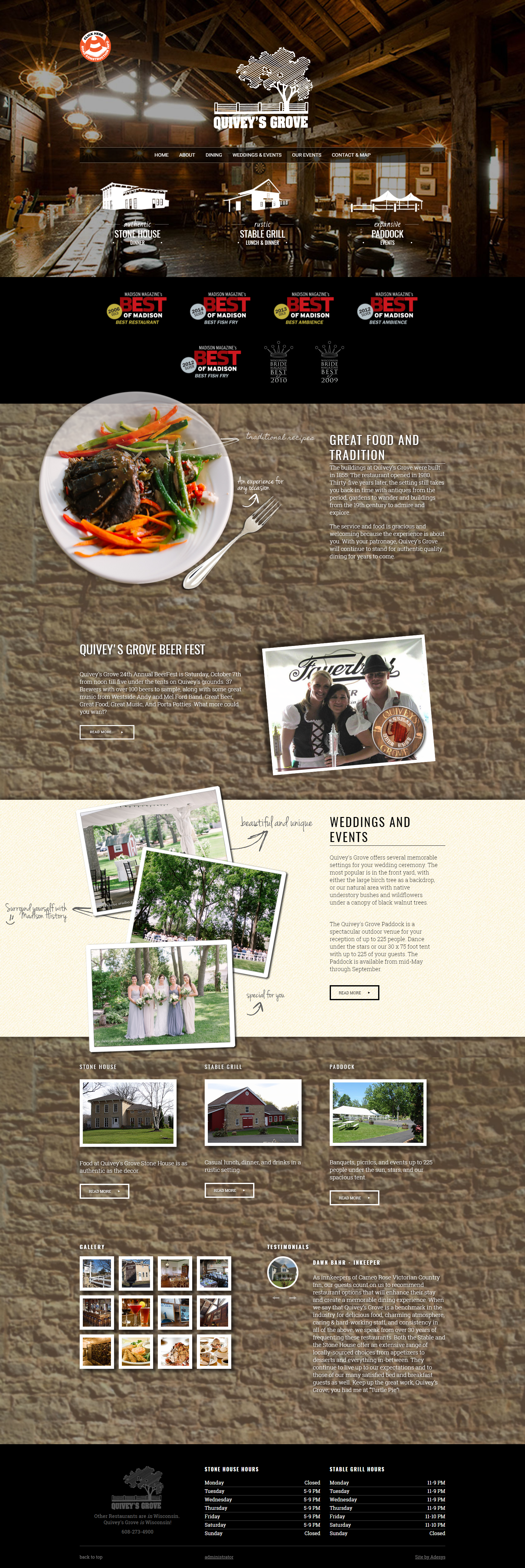
To start the redesign, I focused on the landing page, the first thing users see when navigating to the site. I wanted to update the overall look of the site to keep it modern and in line with today's design standards for familiarity.
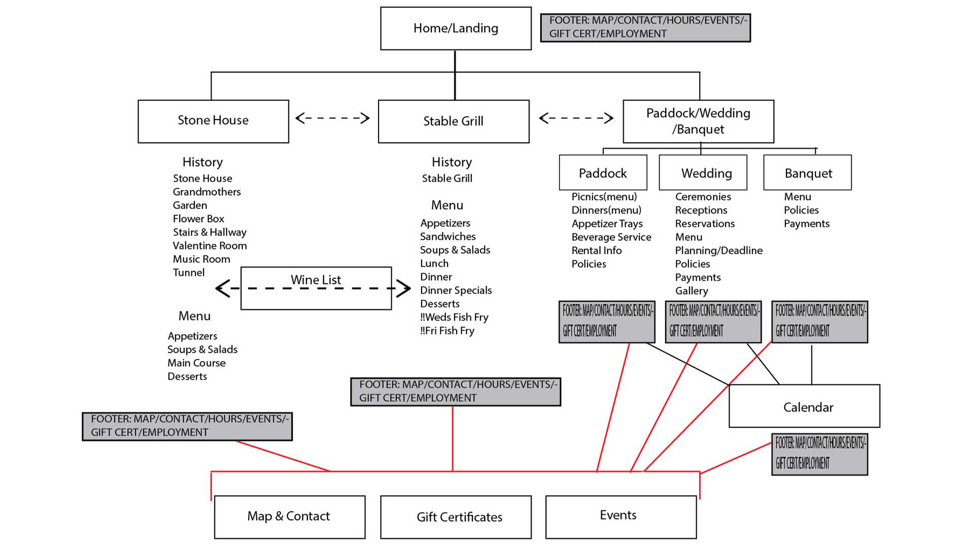
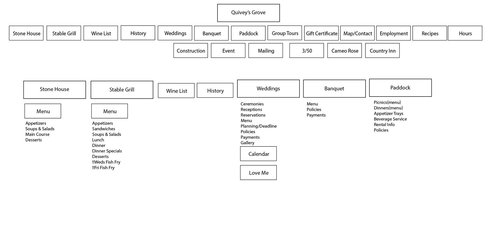
I wanted a clear view for the user on where they could go, and how to find what they couldn't see. Through Google Analytics and interviews with users and staff, it was determined that most visitors where looking for one of three buckets of information pertaining to the restaurant. In the previous website, this was an arduous task. To simplify this discovery for their new site, I designed and implemented icons that could be readily identifiable to users new and old alike. Various options were tested.


Many sections of the previous version of this site were hidden or not easily found for the visitor. This was a top priority for the stakeholders. As many of the timed events and abilities of the restaurant were not being spotlighted, the previous site became a static and almost useless and forgot element of the marketing.
Another benchmark for the client was to ensure that the site had the feel of the brick and mortar restaurant. This was achieved by carefully creating textures, photographs and functionality that had real world relations to the actual restaurant.


I wanted to make sure every capability of the restaurant was able to be found with as few clicks as possible by any visitor in any demographic. I created a site that was a functioning arm of the marketing and as integral to the operation of the restaurant as the brick and mortar location.