Our Redeemer Lutheran Church and School
As a front facing site for both the church and school, I had to design and code a site that had clear and easily accessible sections for the visitor. I also had to consider the back-end setup as the client wanted to be involved with the maintenance of the site as well as keeping up-to-date with relevant information.
CHALLENGE
I was tasked with the design and coding of the site. The challenge for the design involved making all the available and perceived useful information quickly accessible and easy to find for a wide range demographic set of users. As these challenges were addressed in wire-frames and mock-ups, a sister site had to be created for the school and all of its needs. Once design had been locked down, the next challenge was to try and develop the site with the UMBRACO cms as user-friendly as possible.
ROLE
UI/UX designer, visual designer and front-end developer.
UX PATTERNS
I designed, tested and presented an effective user interface to provide the best user experience for all types of site visitors. The client had specific needs that had been relayed from previous site visitors, visitors to the brick-and-mortar as well as employees and volunteers. The UI design process started with interviews of the principal decision-makers with ORLS, from there ui/ux wire-framing was achieved with pen/ink sketches as well as with the Invision app. Site wire-frames became necessary to present the full vision for the client. Interactive mock-ups were used to take the user experience research to the next level. These interactive mock-ups where used in-house to test and streamline the UX and ensure I was solving all the pain points expressed by the client.
SKILLS USED
Primary Software Used: Photoshop | Invision | Html | CSS | Bootstrap | Umbraco | Illustrator | Lucid Charts | Visual Studio | Office
Iterative Design
Design is about smart decision making. I worked hard to make choices that allowed my ui design to help the user understand the options that are available to them. A lot of time was dedicated to the UI/UX research for the project. There was extensive information that needed to be accessible for any visitor, fast. Many competitor site audits were researched as well as current trends to come up with a direction and to get the client on board with design decisions. Mobile first was practiced as a key focus for the final deliverable. A number of concepts where discovered, tested and proven through interviews, user flows and usability testing.

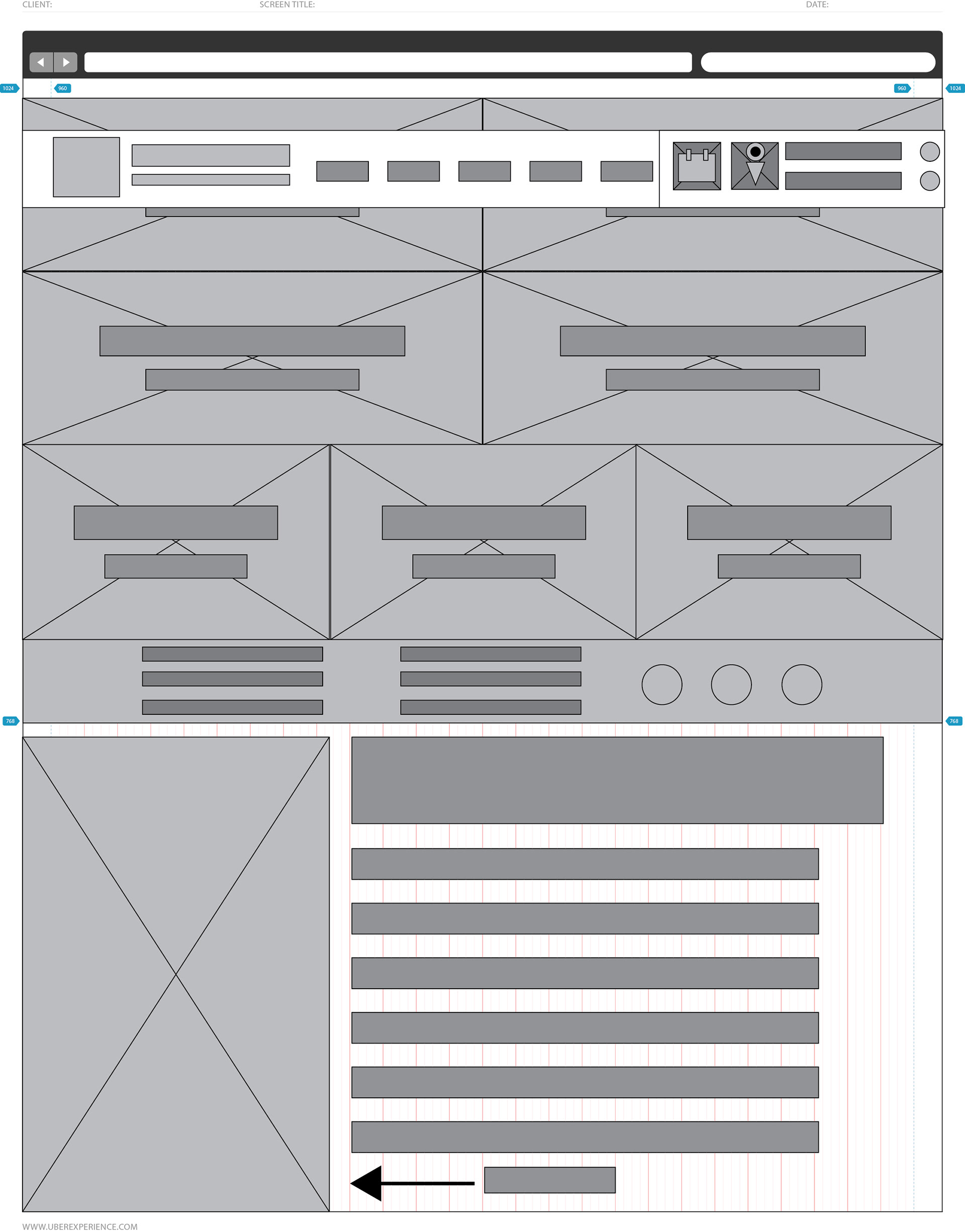
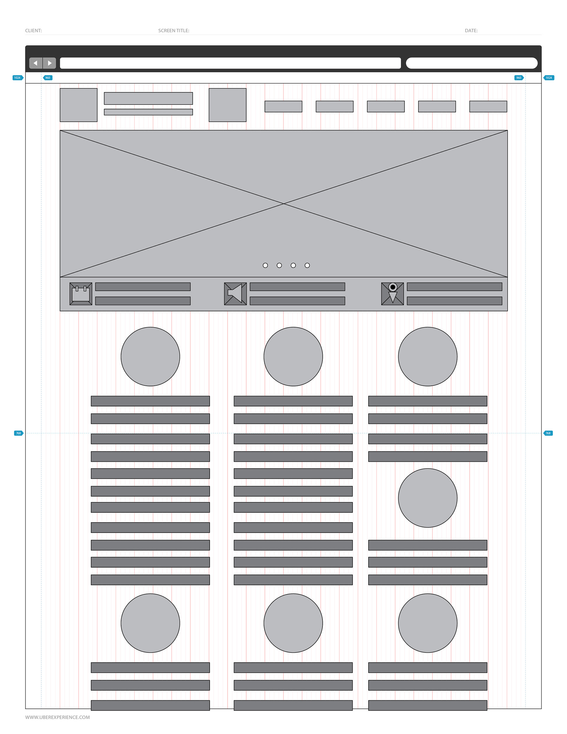
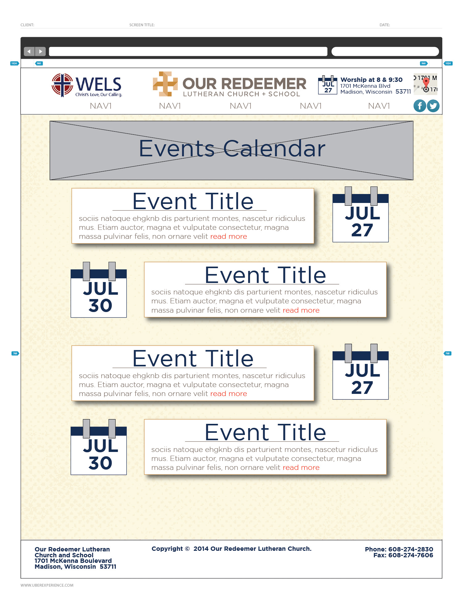
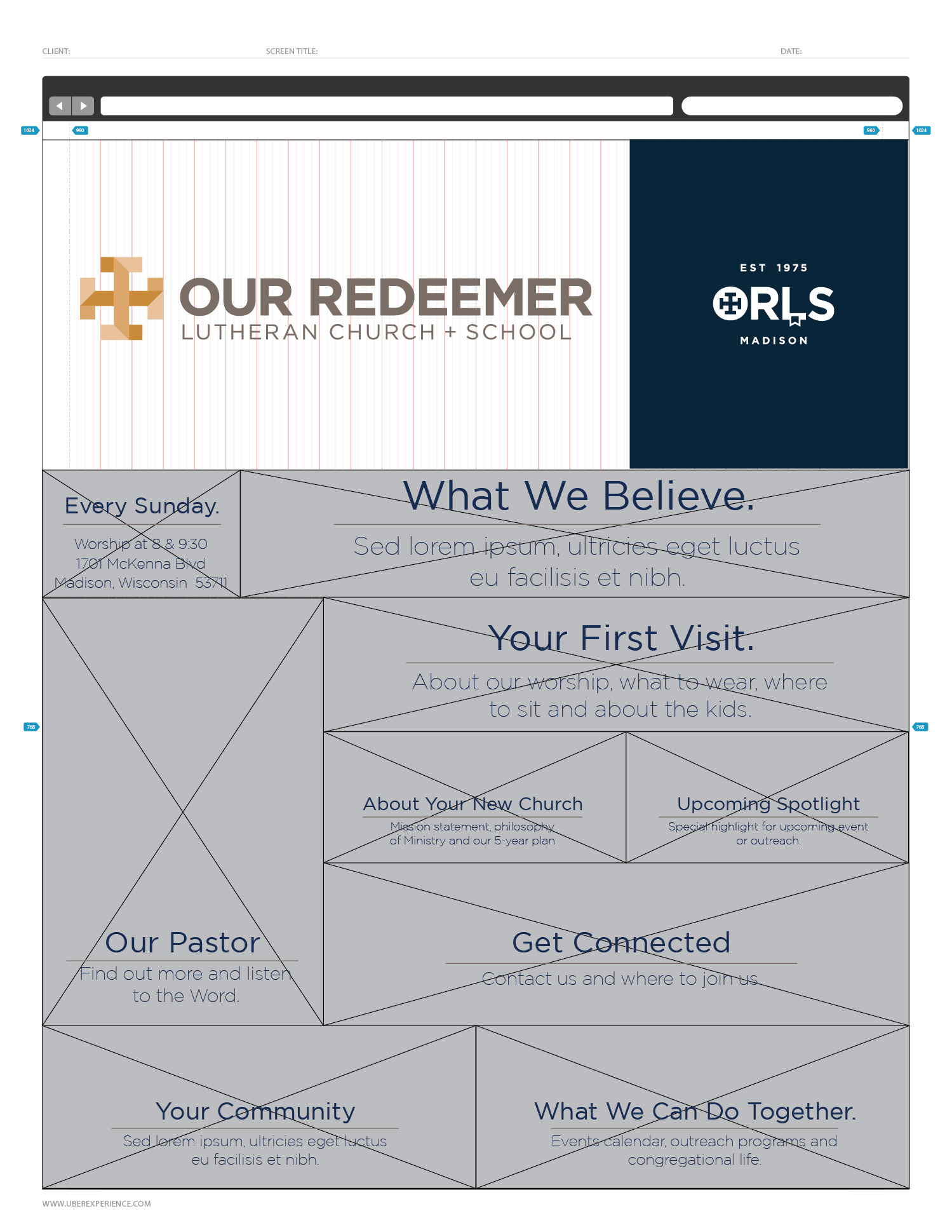
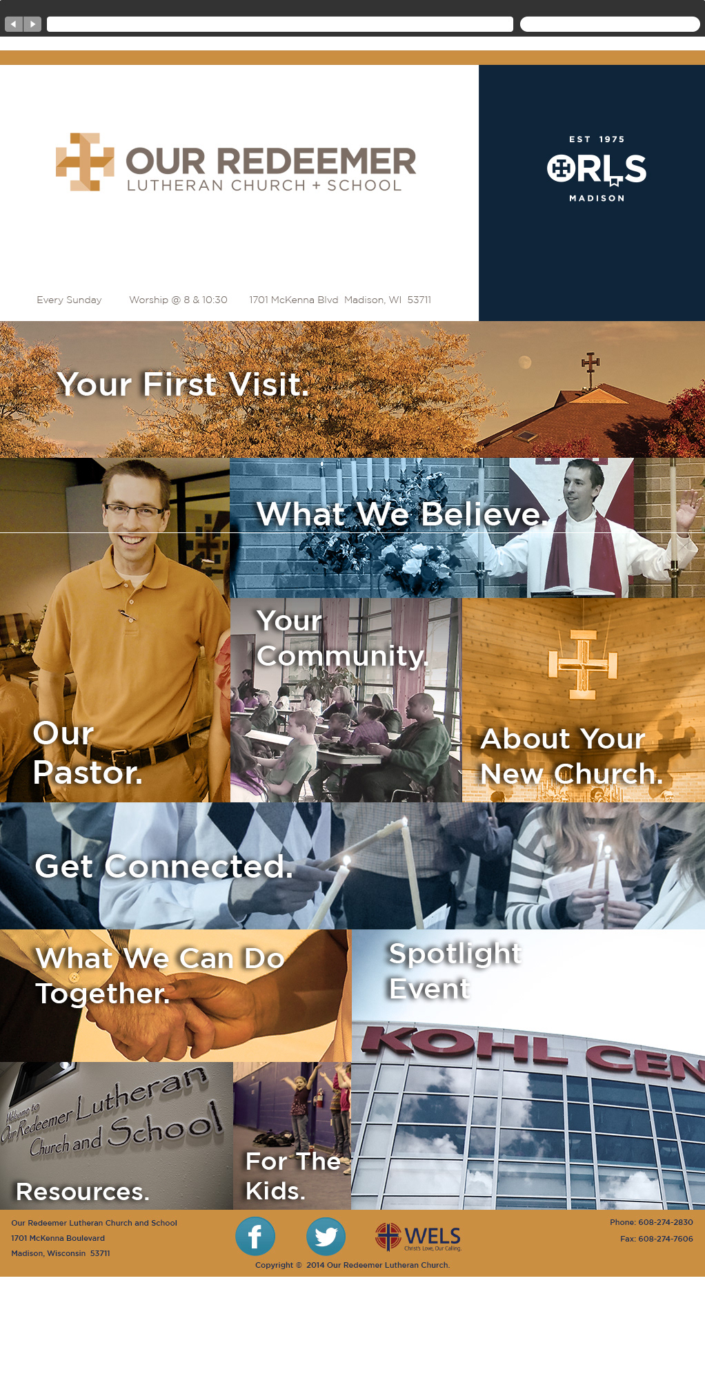

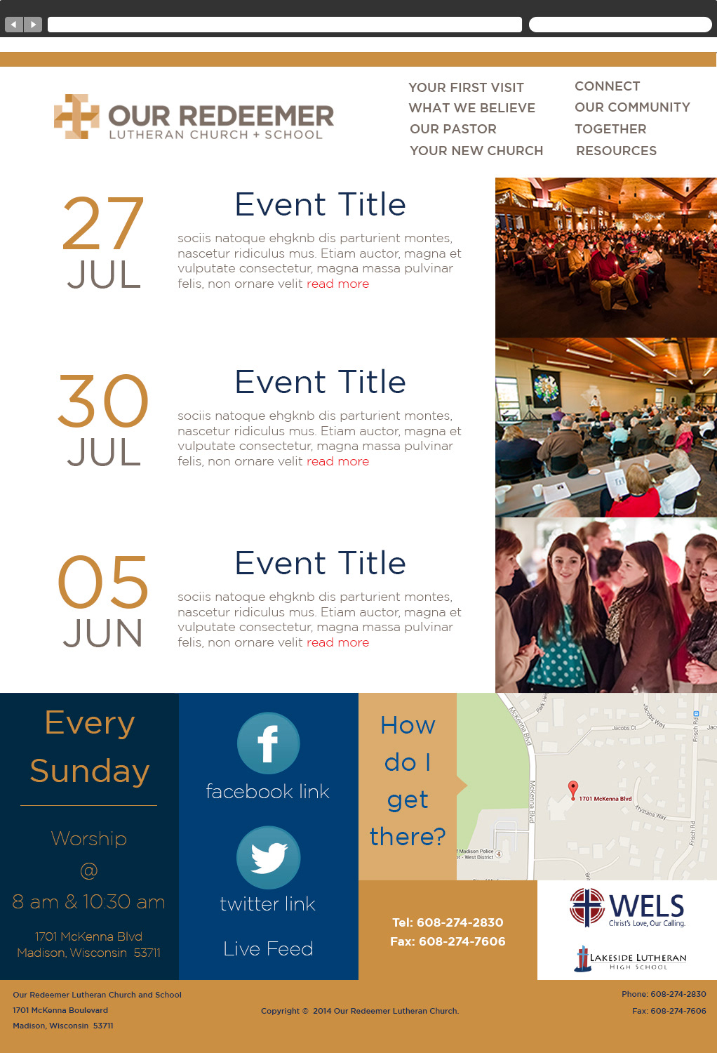
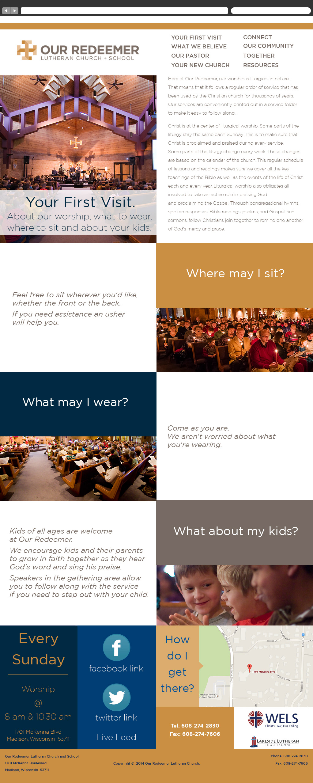
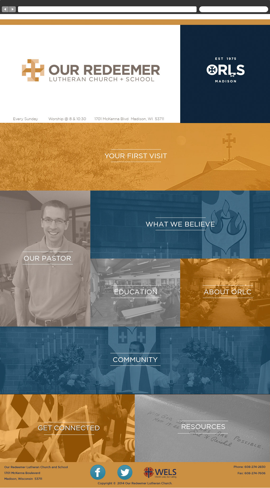
A key for the client was to have everything accessible to the visitor as soon as possible. The client wanted the visitor to get to the information they were looking for with as few clicks as necessary. A navigation focused landing page came out of the research and a/b testing.
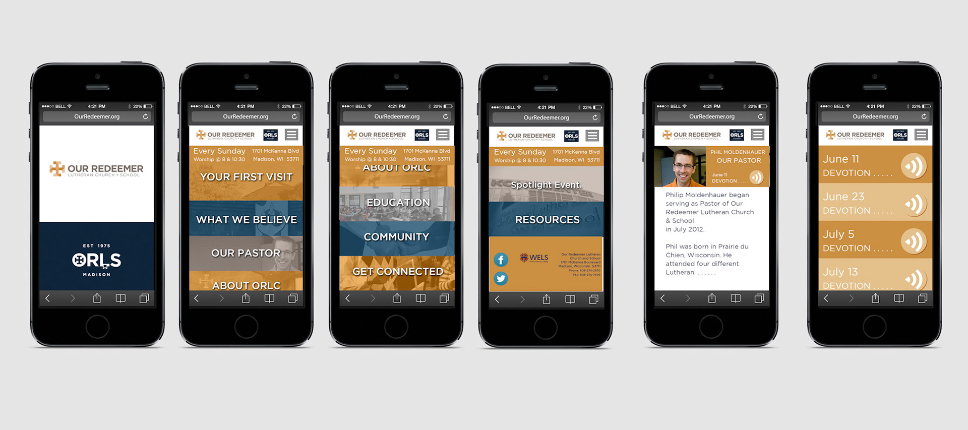


Positive results and more to do
After designs were approved, coding began. The sites were created in UMBRACO cms framework. Umbraco utilizes module based website creation which can lend itself to easy build and customization for clients that are not web savvy but does put a lot of ownership on the back end development. Stakeholders were trained on the new cms.
Although the hand-off went smoothly, after the site was living and performing for the client, information ballooning was not considered in the design. Existing content updates were considered and the site could expand, the navigation had its limitations if new subjects were added. I would have liked to come back and continue to refine the site with Google analytics but that was out of scope for the project.
The end result was that the client was happy and the site was performing for the stakeholders and solving problems for the visitors.