
NVEST SECURITIES - NVEST CROWD FUNDING - Wisconsin Banking Association
I defined the vision for a richer, more accessible site that did the work for the clients. I evangelized this vision and worked closely with the stakeholders and other team members to realize this vision across the site.
CHALLENGE
To update the previous site (WBA) based on pain points perceived by the stakeholders while simultaneously developing two sister sites (NVEST SECURITIES and NVEST CROWDFUNDING) that needed to share design aspects but also be there own brand.
ROLE
UI/UX designer, visual designer and creative empath.
UX PATTERNS
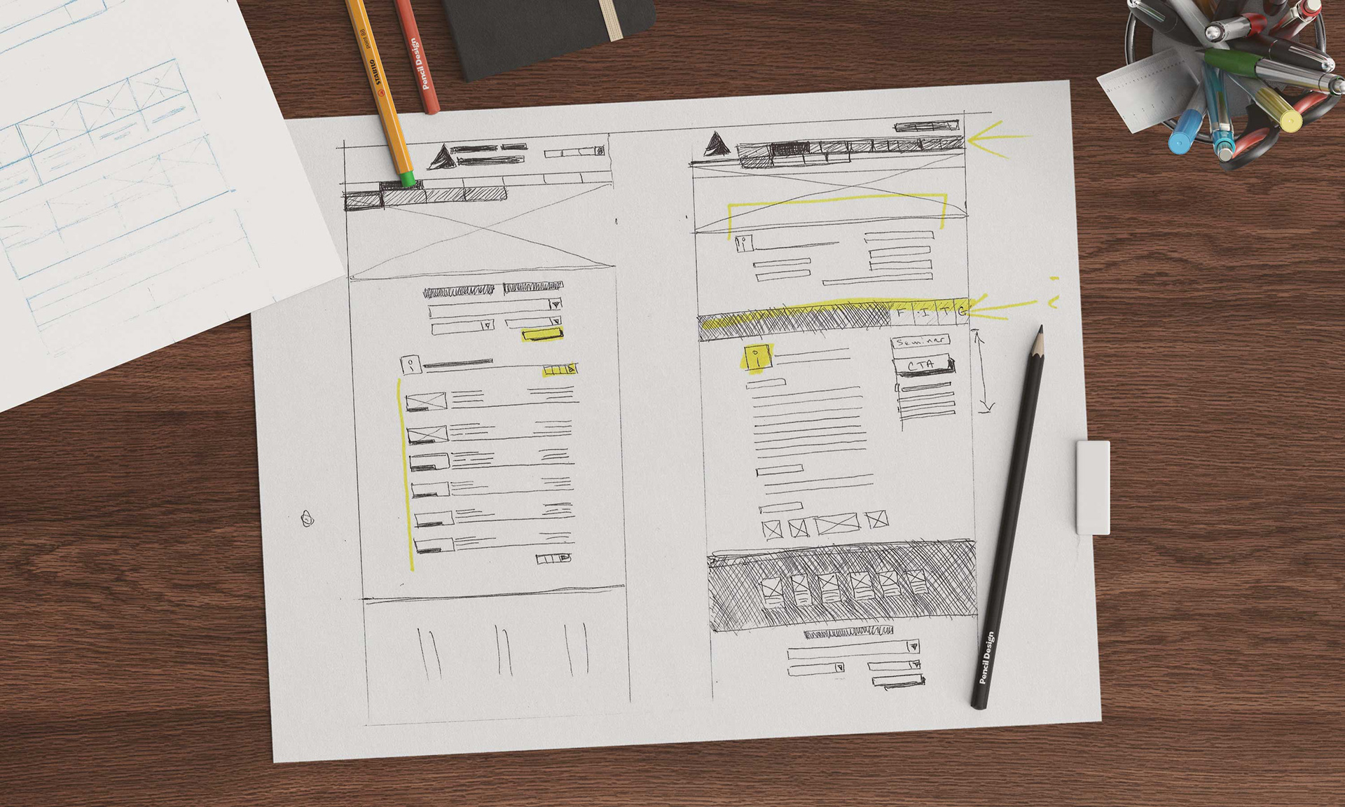
I designed, tested and presented various patterns for all three projects based on researched user flows and perceived needs of the client. The client had a specific vision in mind and wanted to see their products reflect those design aspects and use cases. The UI design process started from UX wireframing. I laid the foundation of interactions and navigation. Wireframes present the set of monochrome screens to think over the layout and transitions before considering the appearance and style. No images and animations, schematic icons and basic typography – all that enabled me to discuss all the flow of interactions simply and effectively.
SKILLS USED
Primary Software Used: Photoshop | Invision | Html | Css | Bootstrap | Illustrator | Visual Studio | Lucid Charts | Balsamiq
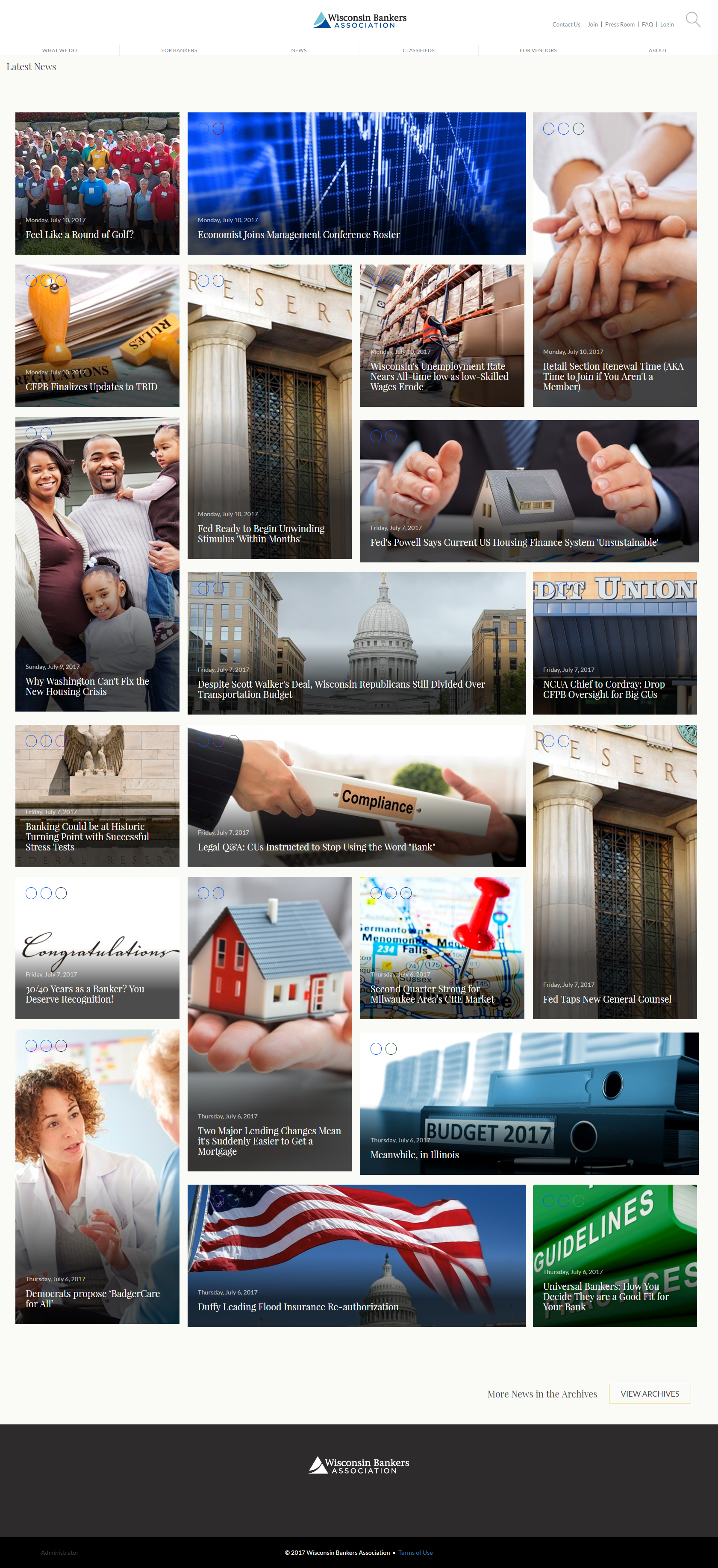
The first project, WBA, took extensive research to discover the best way for the user to access all the information available to them on the "open" side of the site and then additionally there is a "members" secured part of the site that had to have additional user flows added to the original layer of UX.
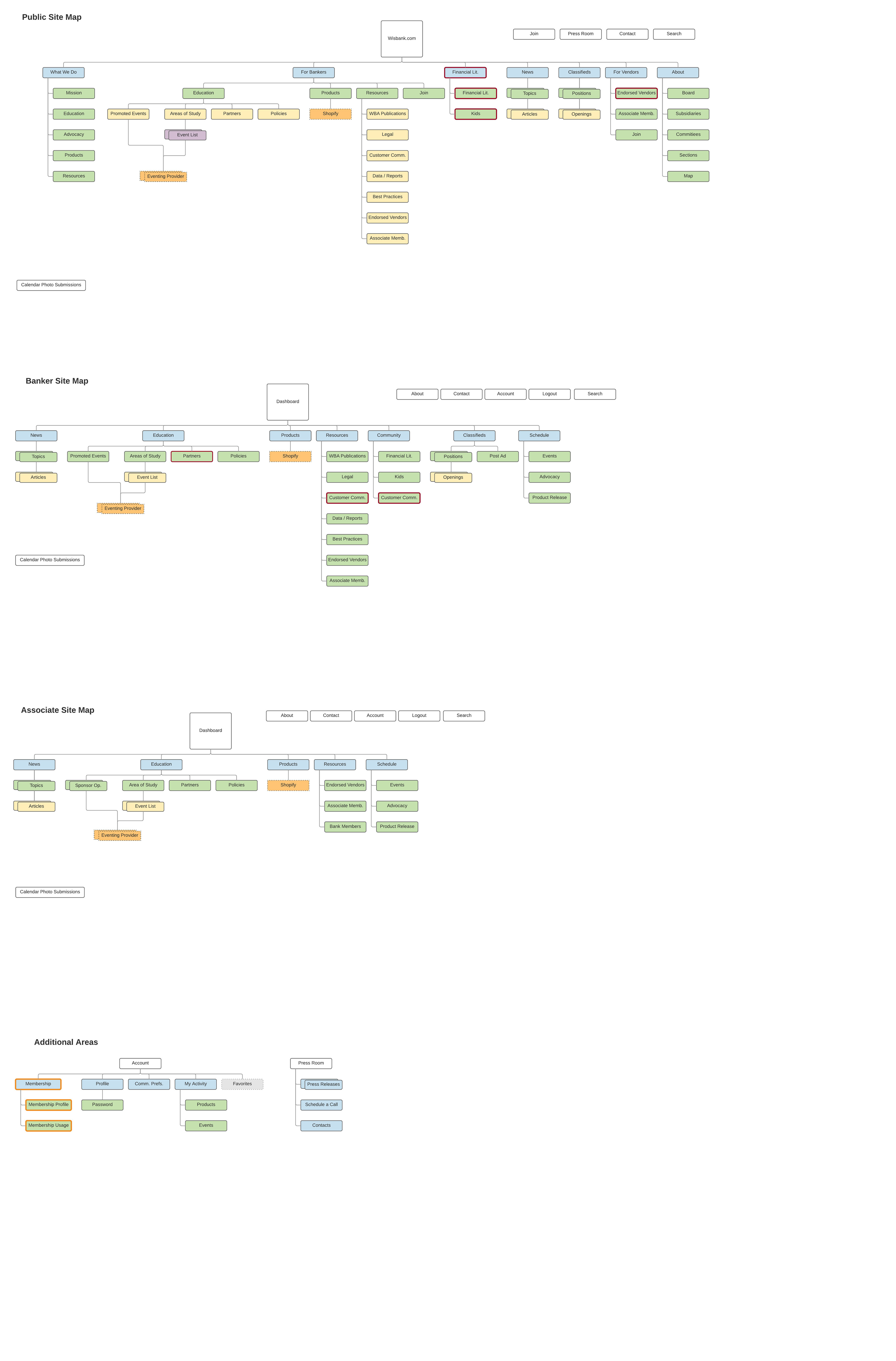
User Flow

Mid-Level Wire-frames

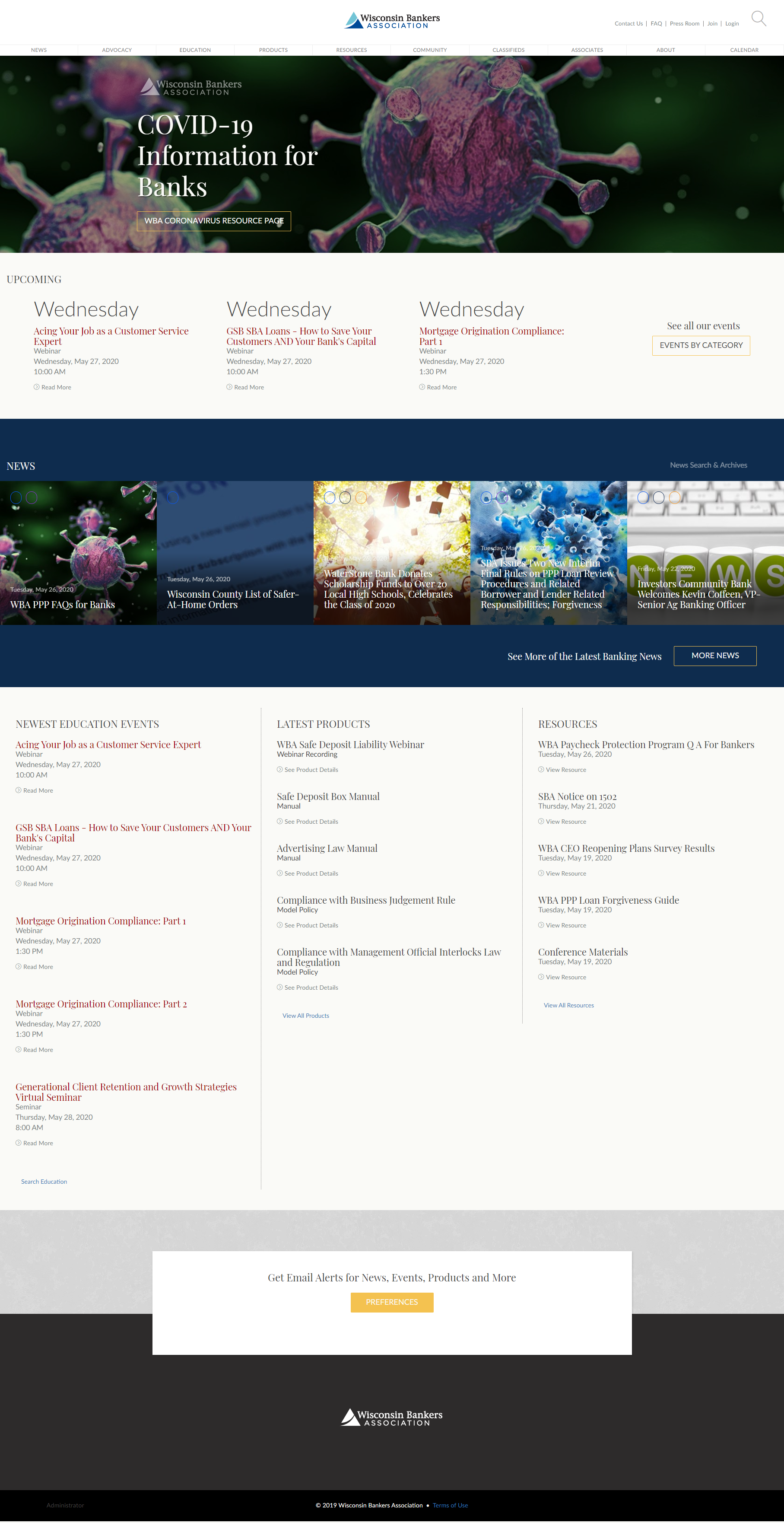
Hi-Fidelity Mock-up

Hi-Fidelity Mock-up Landing Page Option 1
Hi-Fidelity Mock-up Landing Page Option 2
Hi-Fidelity Mock-up Landing Page Option 3
Hi-Fidelity Mock-up Landing Page Option 4
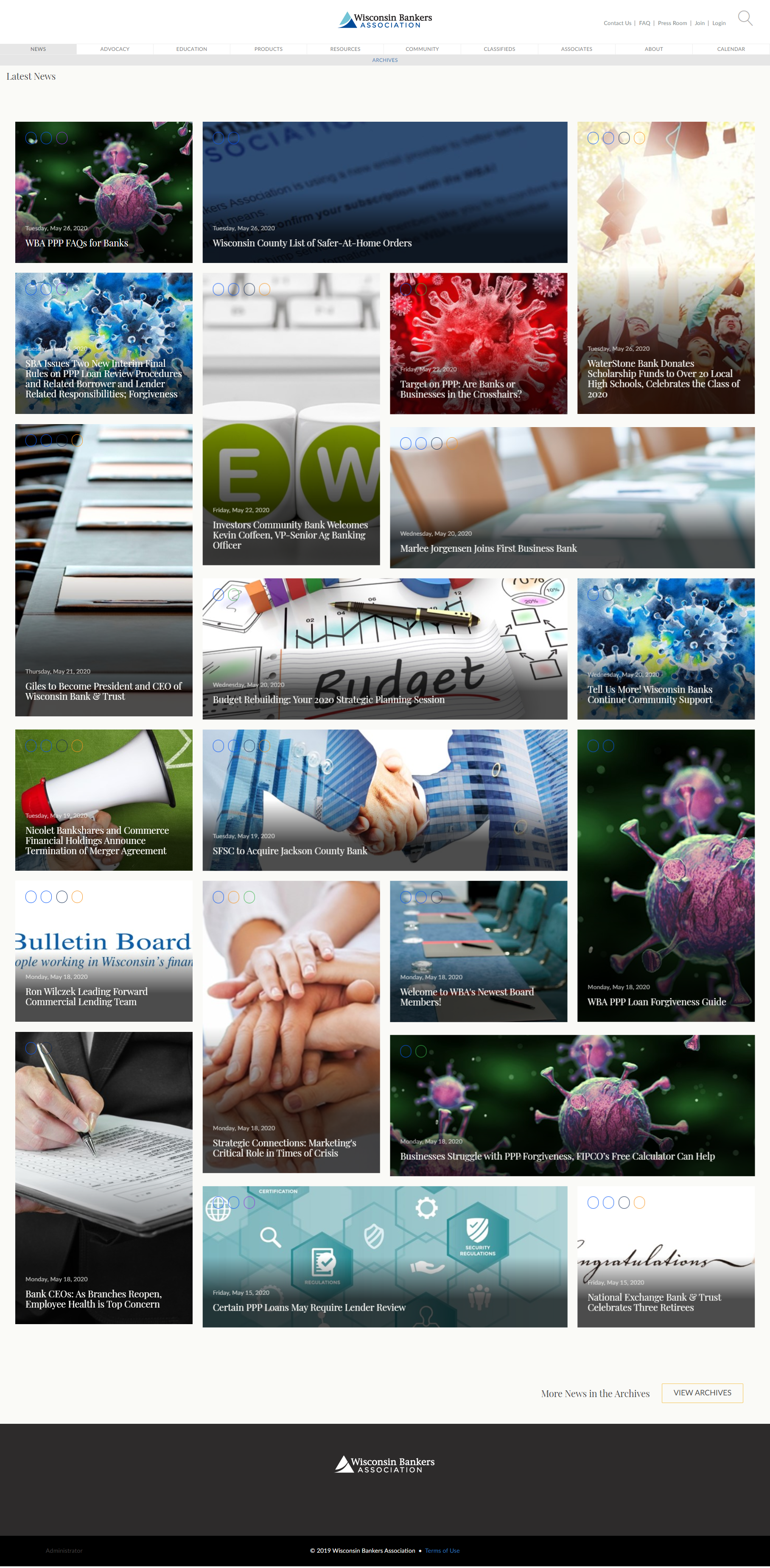
While the stakeholders had a vision of the visual part of the site to replicate then current news and high traffic/extensive info sites, the ability of the visitor to navigate and complete their tasks were paramount. The decision to go with images and quick links to various groups of information tested out to be the quickest and streamlined for visitors to get to where they wanted to go. Simply put, we wanted to get out of the way of the user and let them get to their destination as quickly as they could.
When all the interactions were agreed upon and tested, I continued to work on the UI design stage. It intended to make the already set interaction flow get a nice and catchy appearance and emotional appeal.
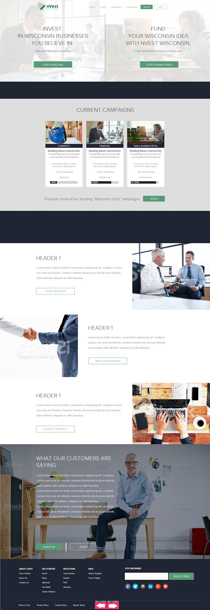
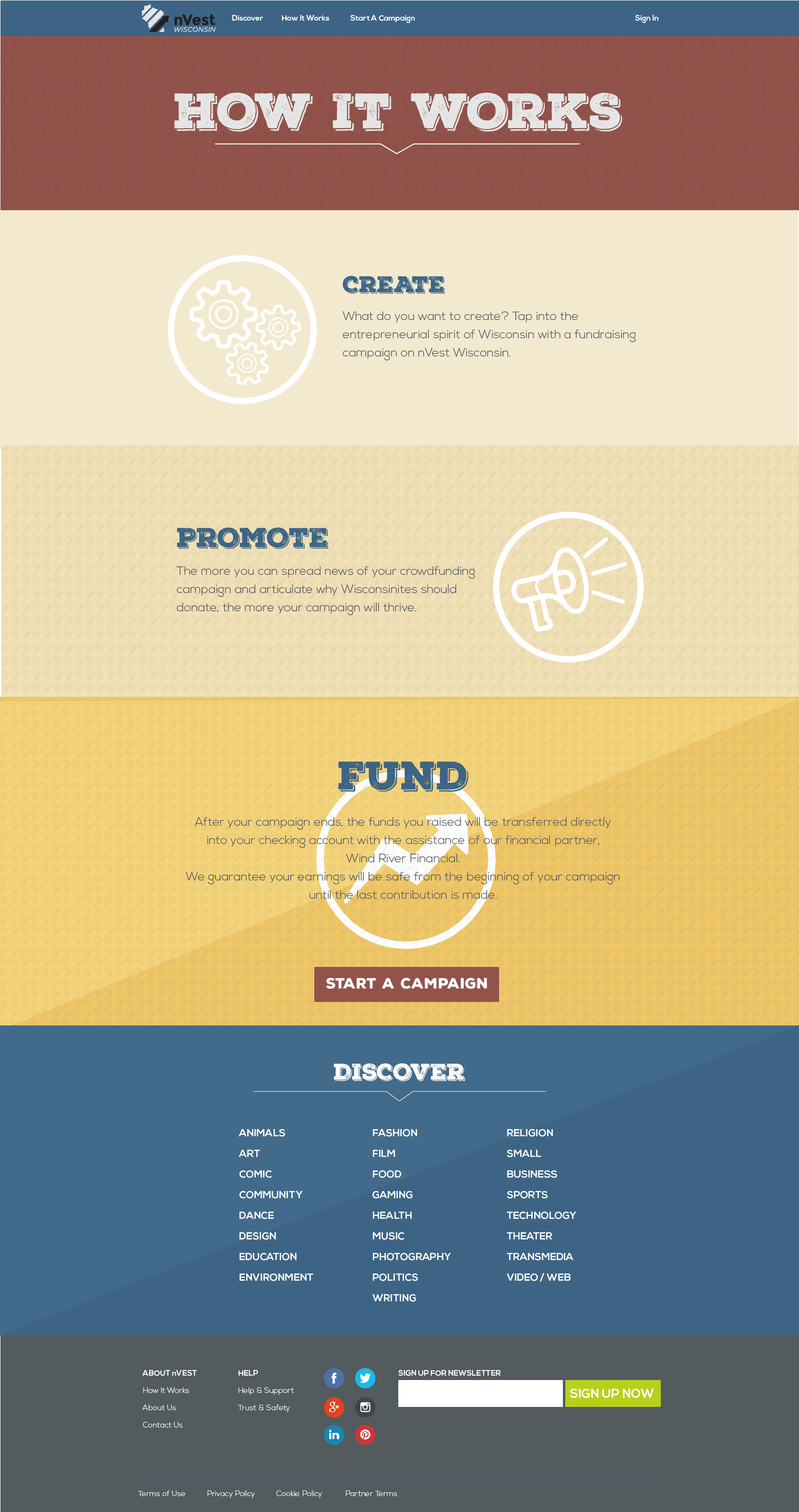
With NVEST Securities we took a more visual approach with the use of colors, directional graphics and font treatments that would give a sense of style and used the current trends to relay a sense of trust and innovation to visitors in a mixed age demographic.
NVEST Securities made it through the design phase as well as iteration and testing but was not executed by the client as they decided to hold on the NVEST initiatives.
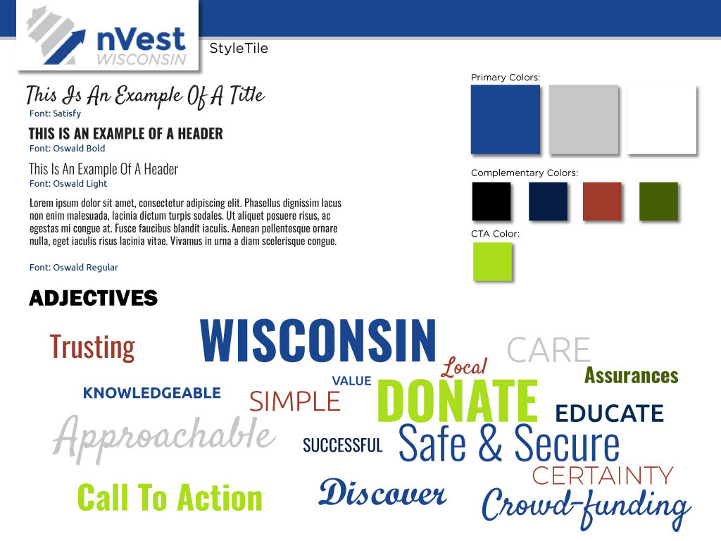
Mood Board
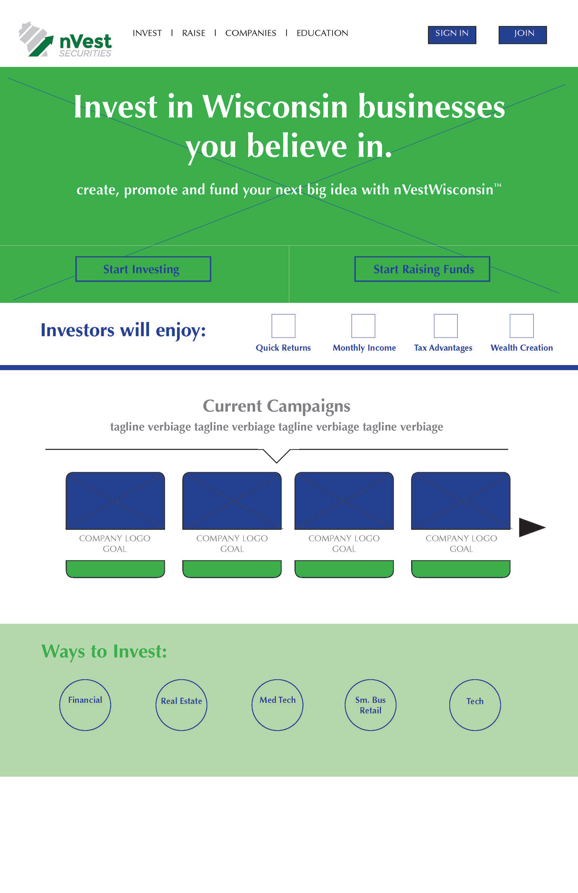
Color Mock-ups - Landing Page

Color Mock-ups - Landing Page

High Fidelity Mock-up - Landing Page 1
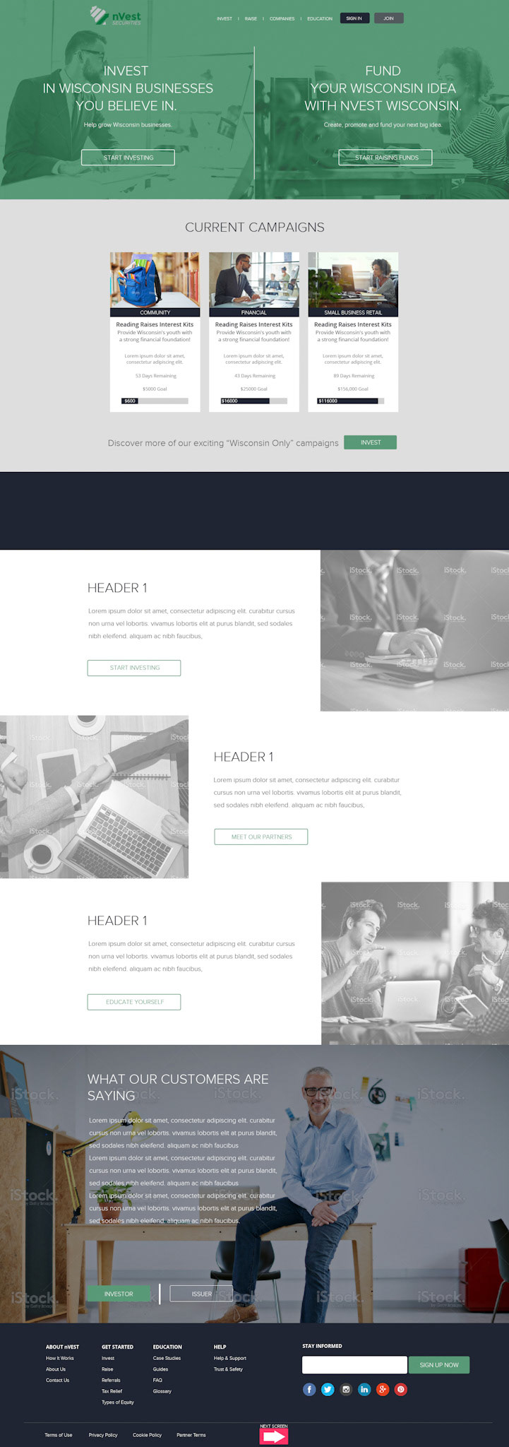
High Fidelity Mock-up - Landing Page 2
High Fidelity Mock-up - Landing Page 3
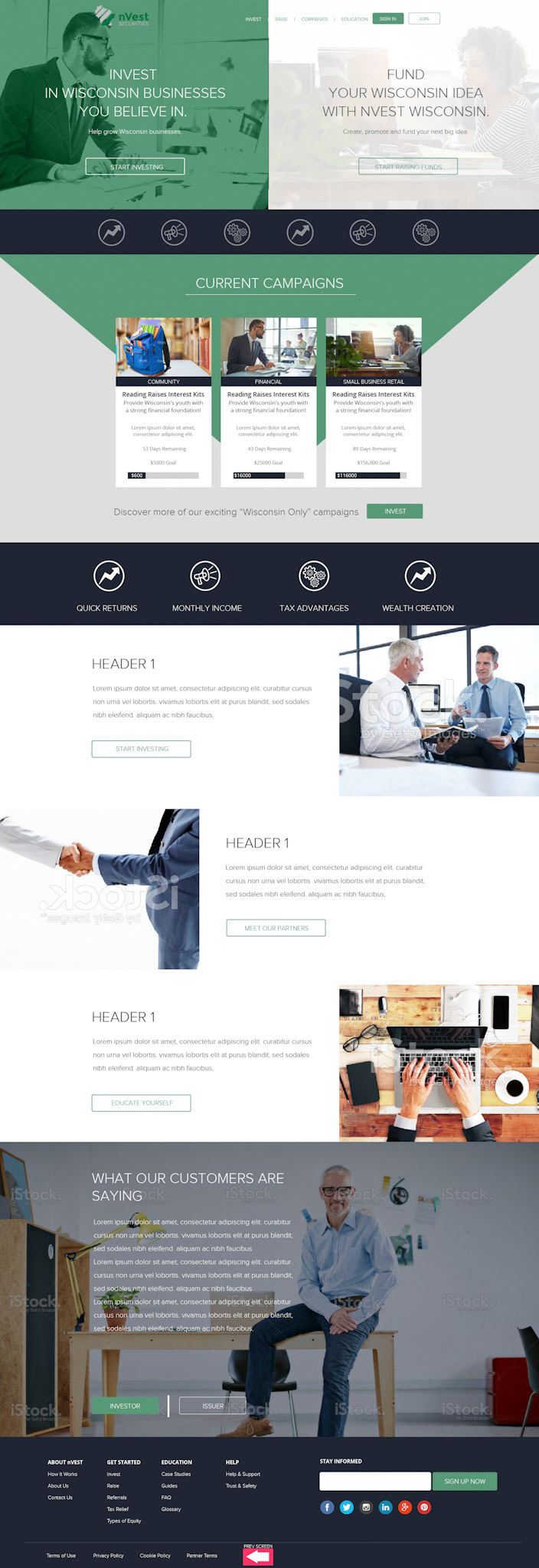
High Fidelity Mock-up - Landing Page 4
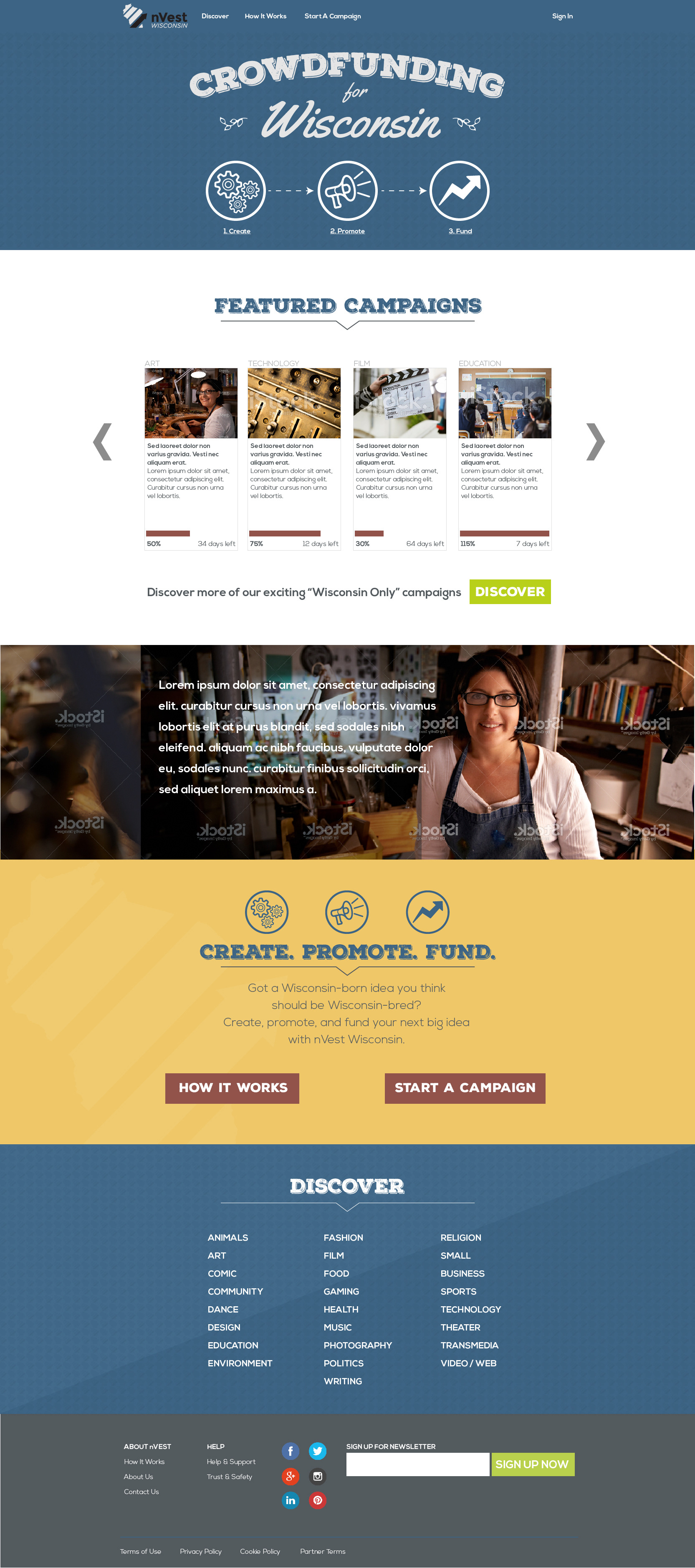
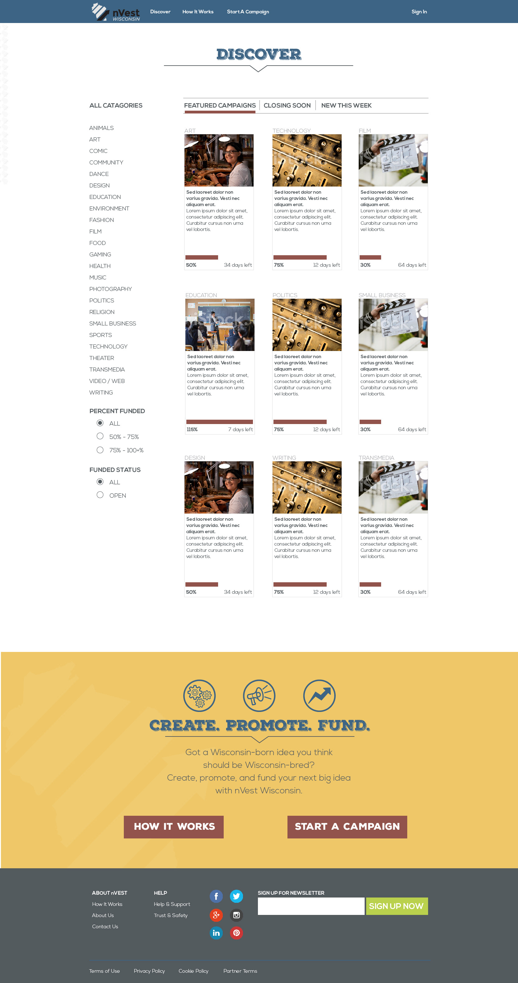
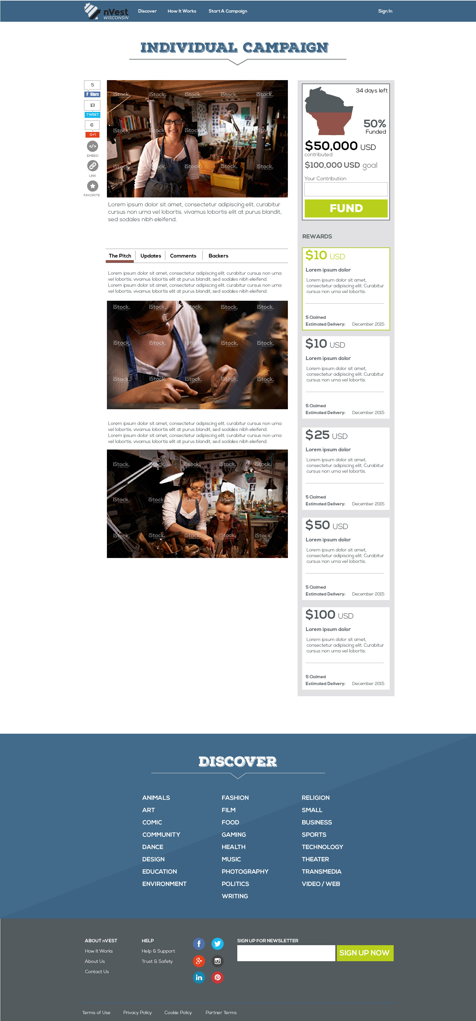
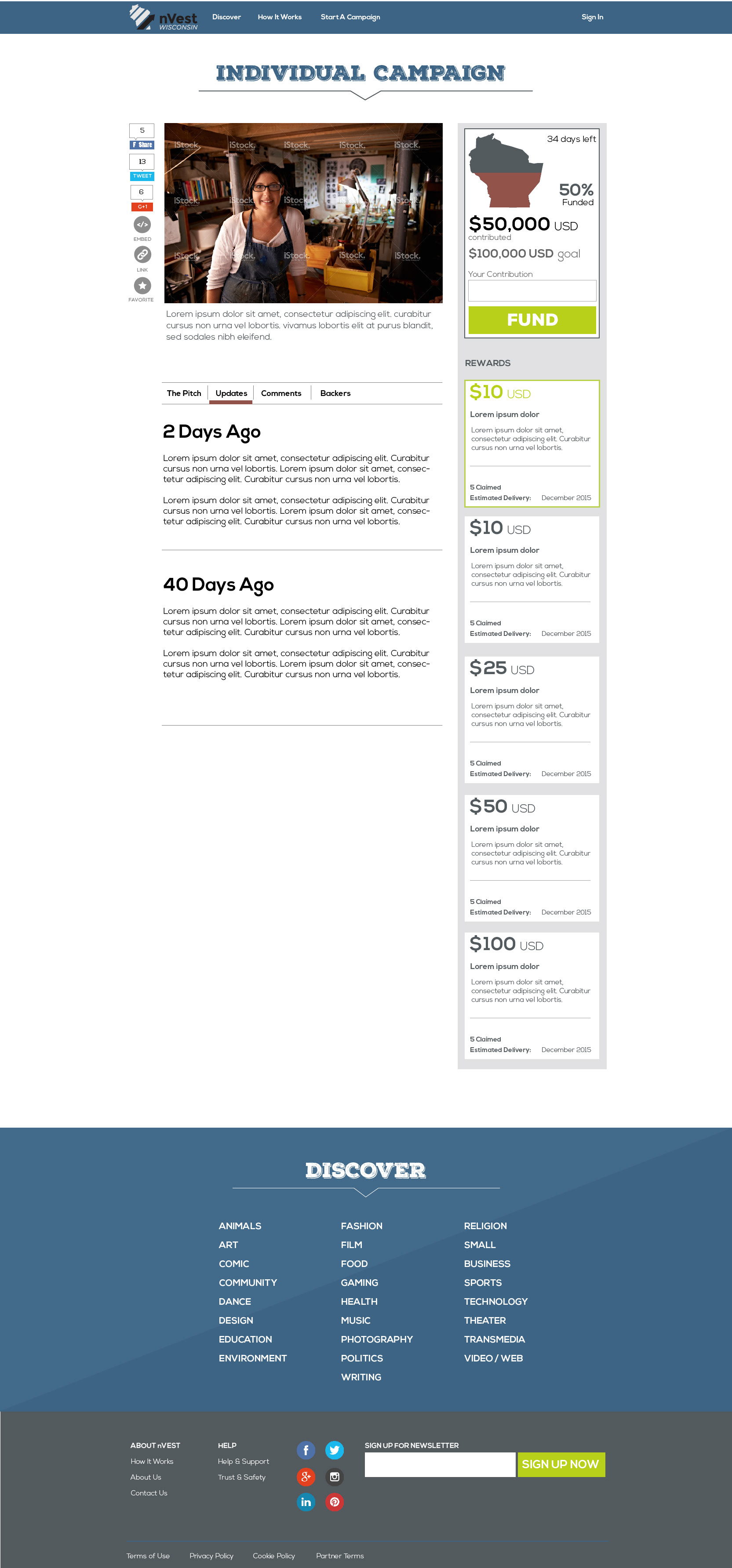
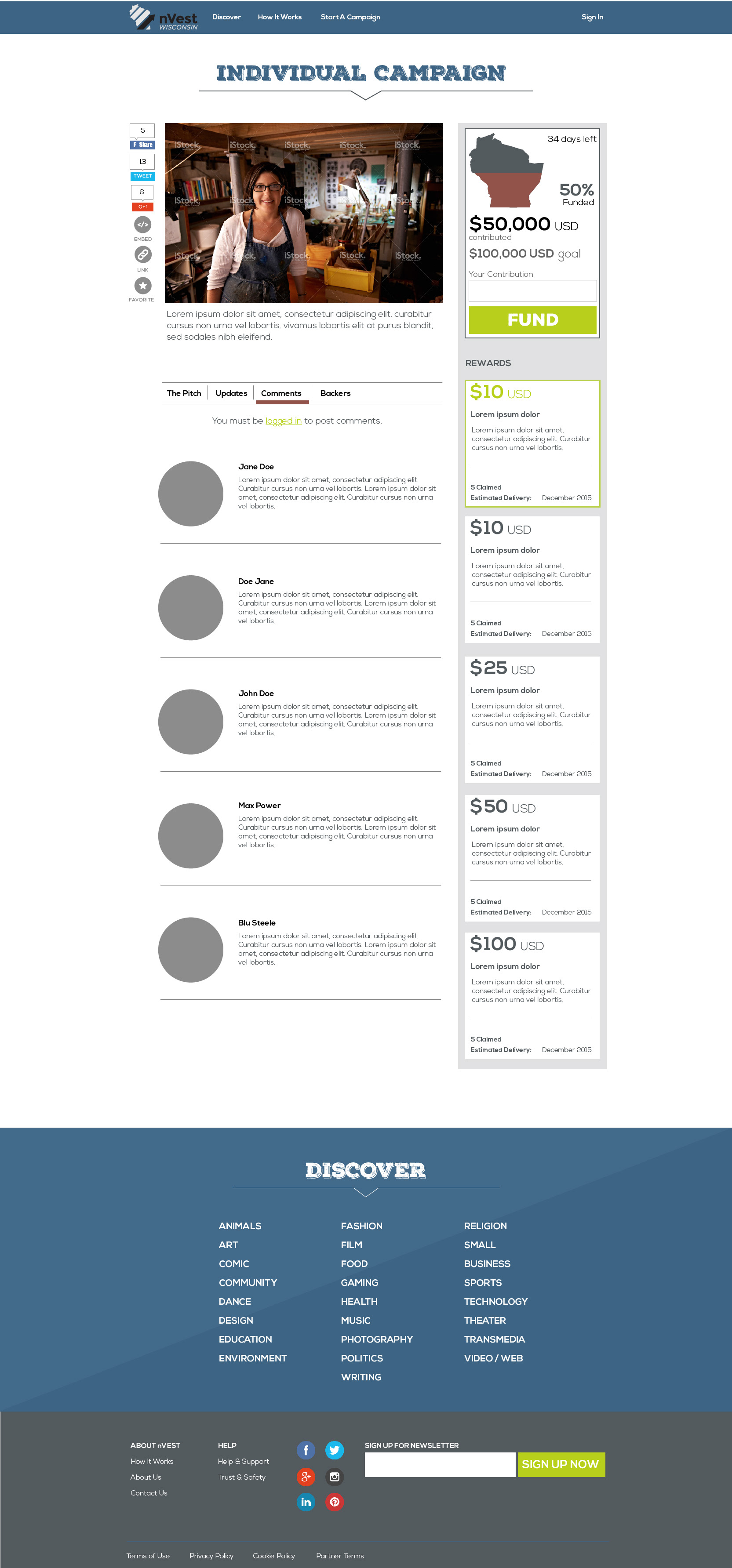
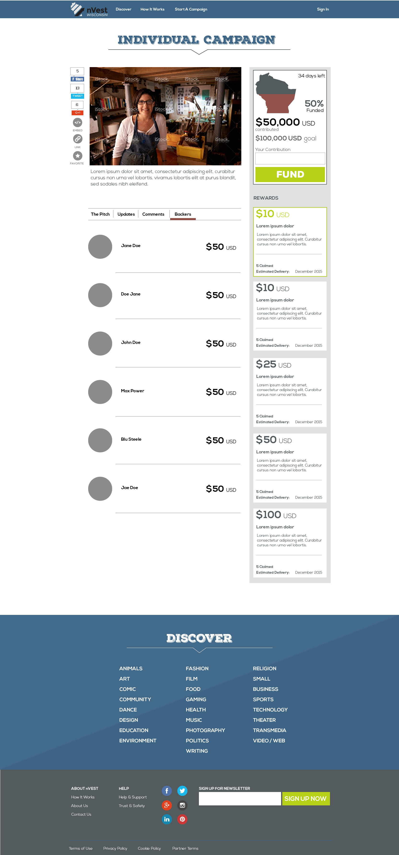
NVEST Crowdfunding also made it through the design phase as well as iteration and testing but was not executed by the client as they decided to hold on the NVEST initiatives. Although all sites were customer facing, the NVEST initiatives were considered more marketing in concept.
Working on UI solutions, I continued to color scheme options to try which one will correspond better to the client’s vision of the marketing site style. So, the client was offered different variants: one was based on warm color palette including much orange and red associated with fun and speed while another used cold colors combination, mostly based on blue, belonging to the most popular among the user's favorite colors. The graphic design assets such as diversity of icons, photos, and textures, were also designed from scratch for the NVEST sites to give it fresh and original look.
The process of creating website UI/UX is usually focused on solving a problem or helping users satisfy their needs, so as a designer I have to think much about how to support the utility of the digital product. Visitors aren’t ready to spend much time fiddling with unclear navigation, they want it intuitive and bringing them right to their purpose for visiting the site. That is what, as the designer, I had to keep in mind while keeping the design aesthetic the client wanted or expected.
I managed to keep all three site designs in a single tone creating the feeling of the websites unity. Moreover, such a construction of the sites and navigation makes it flexible for further alterations, for example, adding more pages that are particularly popular with visitors of the website.