CAPITAL CITY CLEANERS - DESIGN AND DEVELOPment
I defined the vision for a more accessible content rich site that did the work for the clients. I evangelized this vision and worked closely with the stakeholders and other team members to realize this vision across the site.
CHALLENGE
UI/UX design for on-boarding landing page presenting a website about services provided be Capital City Cleaners.
ROLE
UI/UX designer, creative direction, and developer.
UX PATTERNS
I designed and tested common UX patterns to be used across the site. These patterns had flexibility built in to cover a wide range of customer requirements per task, while creating consistency across the site.
SKILLS USED
Primary Software Used: Photoshop | Invision | Html | Css | Bootstrap | Illustrator | Visual Studio | Lucid Charts
To start the redesign, I focused on developing a clean design aesthetic. Initially I needed to discover the visitors flow and how to help direct them to the stakeholder's desired end. I wanted to update the overall look of the site to keep it modern and in line with today's design standards for familiarity but also provide a clean and clear path for the visitor.

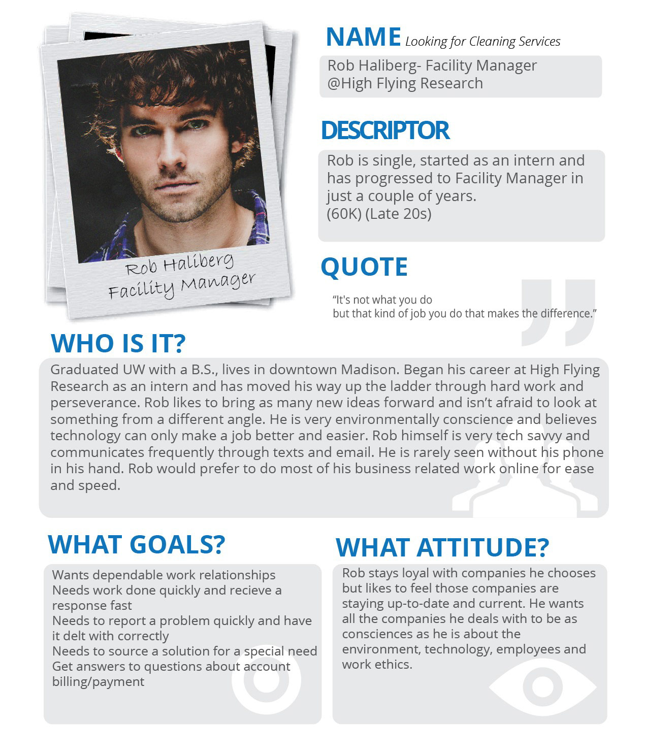
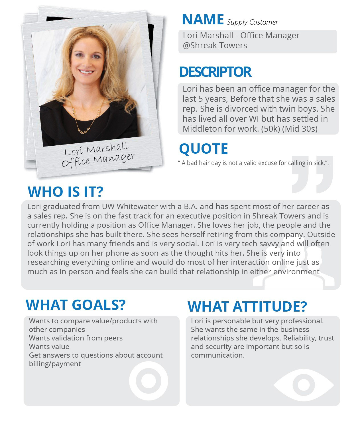
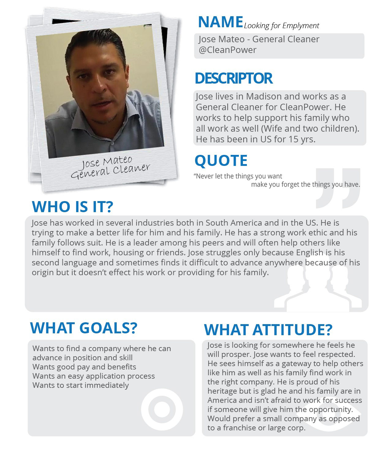


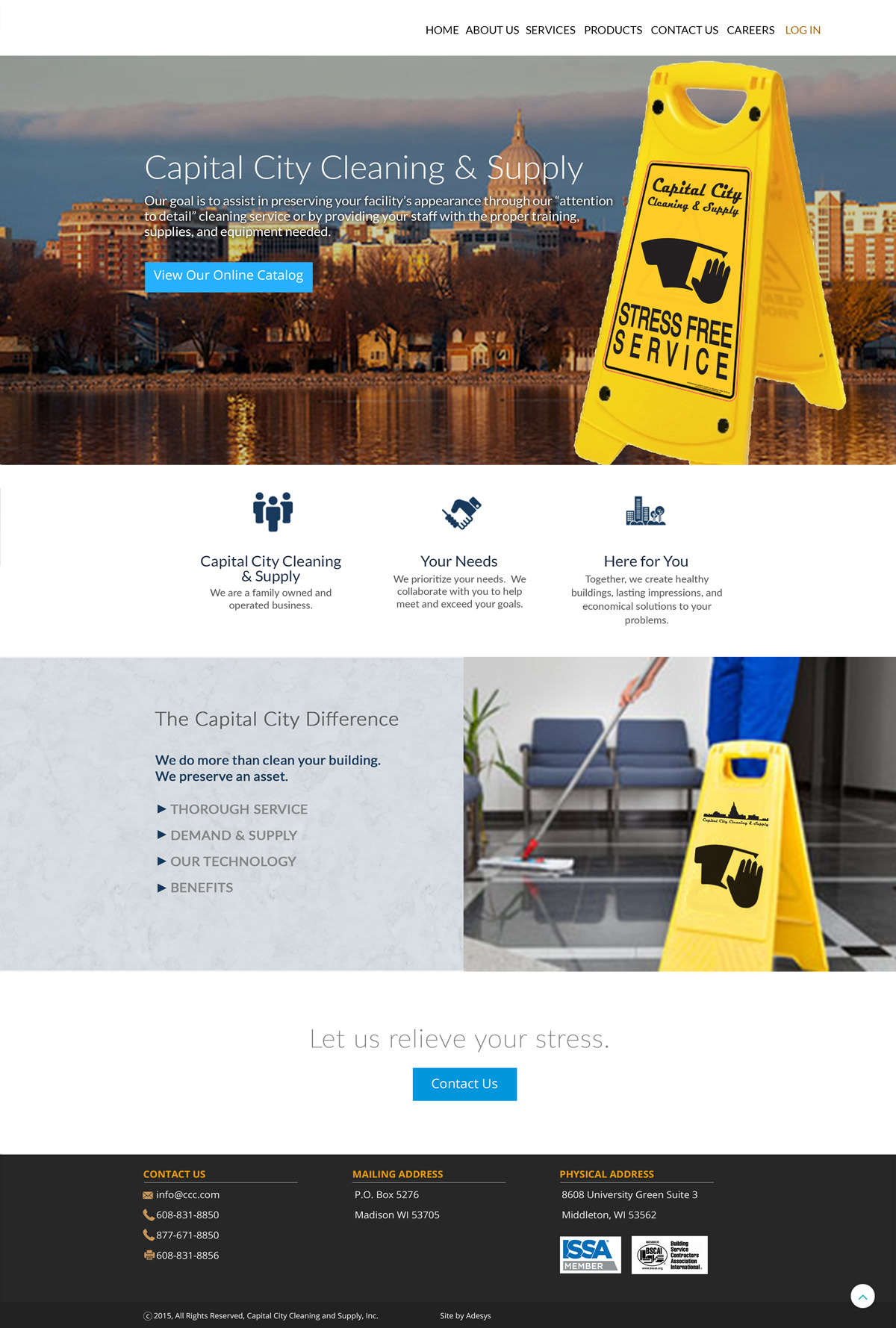
Capital City Cleaning wanted to show their connection to their local clientele and provide a way for the site visitors to discover Capital City's services, products and how to connect online when the visitor had questions.
A lot of time was put into the development of flowcharts, personas and wire-frames to really nail down the best user experience within the developed design guide.
Many design concessions were made to make the overall site simple for visitors. After testing and doing some Qualitative Research, we added case studies to the landing page to help with social proofing the company to new and not yet committed visitors to the new site.
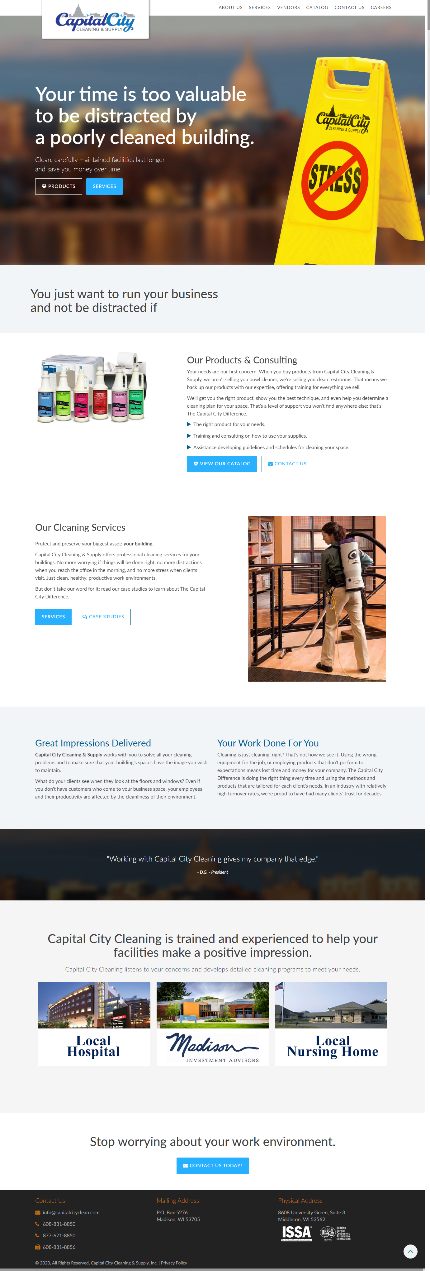
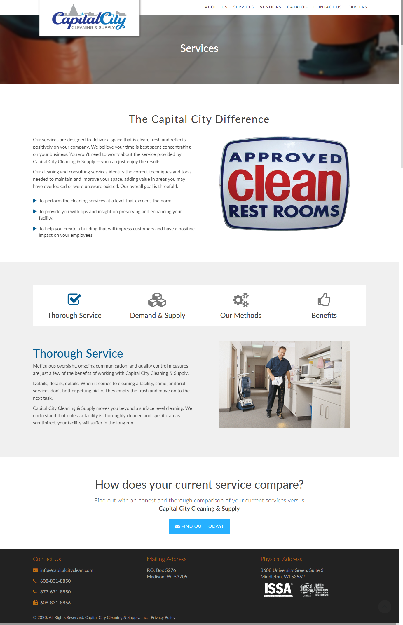
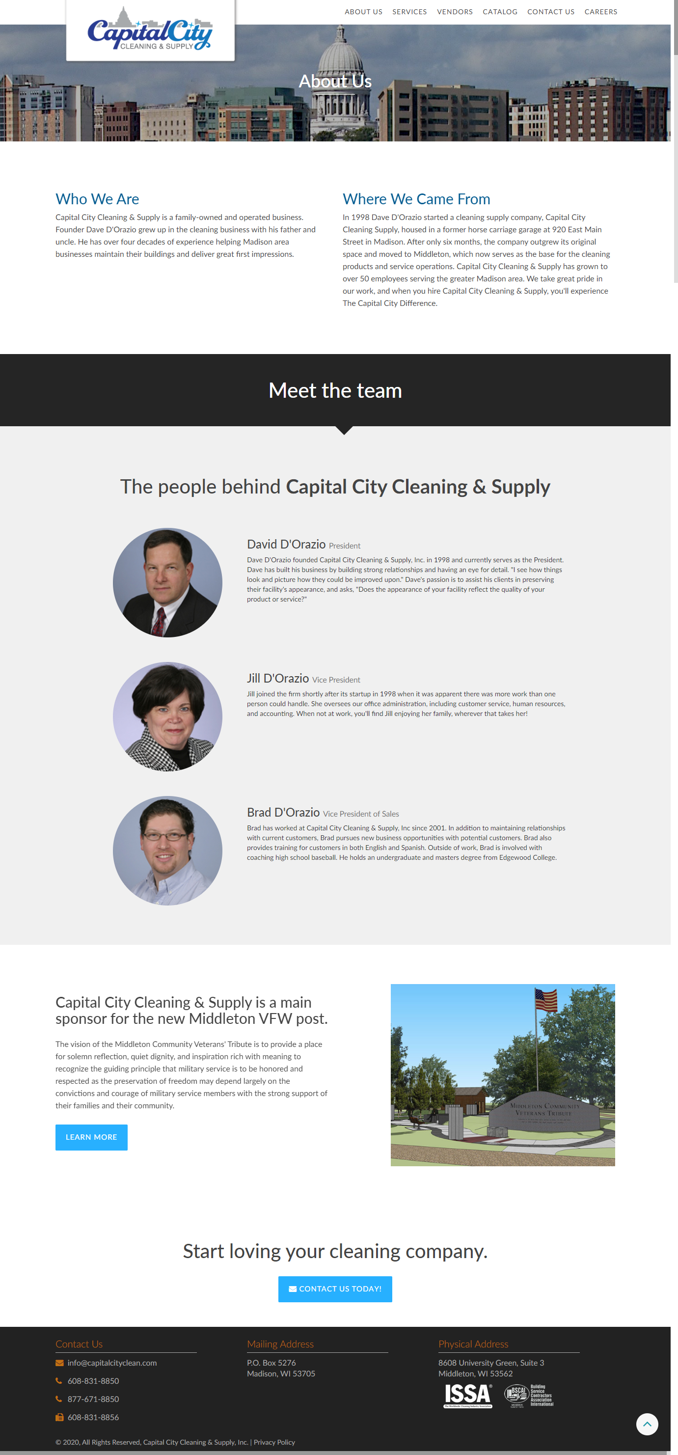
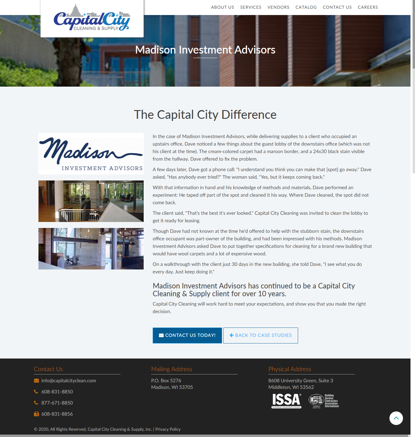
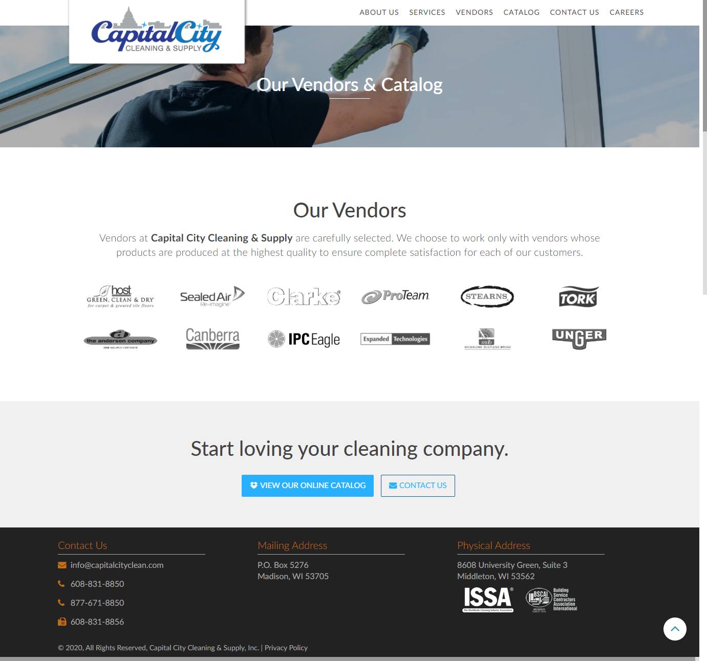
Sometimes as a designer you have to get out of your own way for the betterment of function. And that is what I did here. The research showed that the information needed to be laid out as simple as possible for better functionality for the visitor. I removed a lot of the typical trappings of designing a site that is not overwhelmed with content. The story may be short and to the point, the website does the work for the client, not just a placeholder for information.